Fig. 6
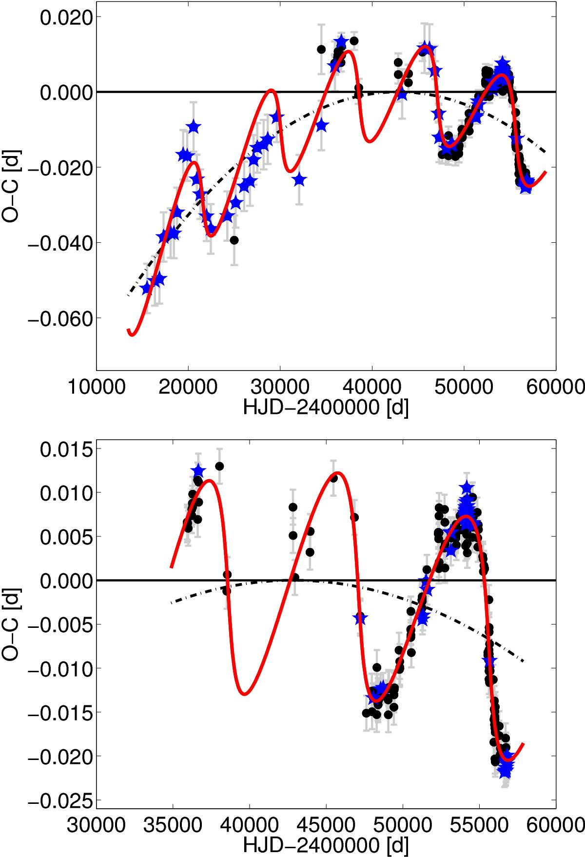
O–C diagram of TU UMa. Black circles and blue stars display the maxima adopted from the GEOS database and new maxima determined in this work. The period decrease manifested by the parabolic trend (dot–dashed line) is obvious. Cyclic changes due to an orbital motion are also clearly visible. Our model of LiTE is represented by the solid red line. The top panel shows model 1 with all available data, while the plot in the bottom panel shows the situation with only photoelectric, CCD, and DSLR observations (model 2).
Current usage metrics show cumulative count of Article Views (full-text article views including HTML views, PDF and ePub downloads, according to the available data) and Abstracts Views on Vision4Press platform.
Data correspond to usage on the plateform after 2015. The current usage metrics is available 48-96 hours after online publication and is updated daily on week days.
Initial download of the metrics may take a while.