Free Access
Fig. 11
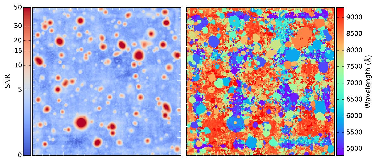
Information maps to illustrate the detection process in the data cube. Left: maximum map obtained by taking the peak flux for each spectrum of the matched filtered data cube. Right: peak wavelengths map. Candidate areas are colored according to the wavelength of their emission peak.
Current usage metrics show cumulative count of Article Views (full-text article views including HTML views, PDF and ePub downloads, according to the available data) and Abstracts Views on Vision4Press platform.
Data correspond to usage on the plateform after 2015. The current usage metrics is available 48-96 hours after online publication and is updated daily on week days.
Initial download of the metrics may take a while.