Fig. A.2
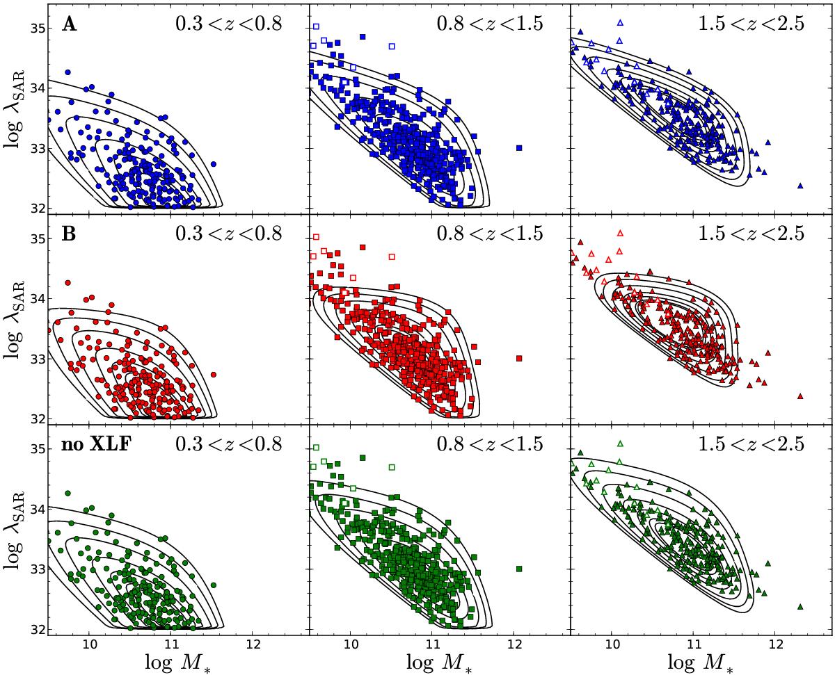
Comparison of the bivariate distribution in the M⋆−λSAR plane between the observations (symbols) and the prediction from the best-fit model (black contours) in the three redshift bins as labeled. The upper panels show the comparison for our default model A), the middle panels show the prediction from the best-fit M⋆-independent SARDF model B), and the lower panels show the best-fit solution if no XLF data are included in the likelihood function (“no XLF”). Open symbols indicate upper limits in M⋆.
Current usage metrics show cumulative count of Article Views (full-text article views including HTML views, PDF and ePub downloads, according to the available data) and Abstracts Views on Vision4Press platform.
Data correspond to usage on the plateform after 2015. The current usage metrics is available 48-96 hours after online publication and is updated daily on week days.
Initial download of the metrics may take a while.