Fig. 5
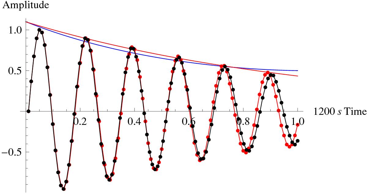
Normalized loop displacement at the apex for both cooling (red dots) and non-cooling (black dots), over time. The red curve represents the best-fit exponential decay, while the blue curve is the analytically predicted amplitude (Ruderman 2011a), both shown for the cooling case. The displacements were obtained by centre-of-mass tracking in the apex cross-section of the loop.
Current usage metrics show cumulative count of Article Views (full-text article views including HTML views, PDF and ePub downloads, according to the available data) and Abstracts Views on Vision4Press platform.
Data correspond to usage on the plateform after 2015. The current usage metrics is available 48-96 hours after online publication and is updated daily on week days.
Initial download of the metrics may take a while.