Fig. 6
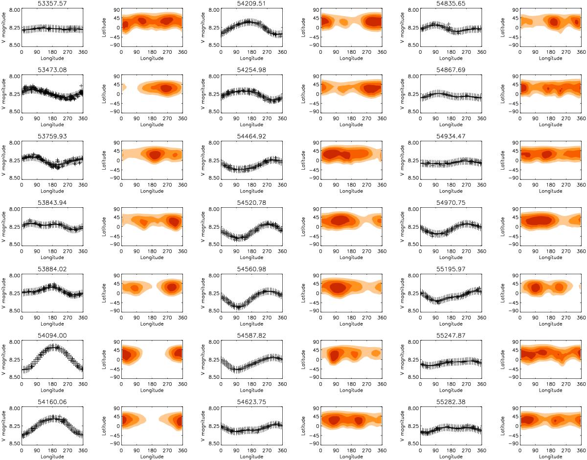
Spot filling factor maps for 2005 January–2010 April. In light curve plots, the crosses denote the observations and the solid line the inversion result. In the spot-filling factor maps, the darker colour means a larger spot filling-factor. In both plots, the x-axis is longitude in degrees, the y-axis in the light curve plots is V magnitude, and in the spot-filling factor maps latitude in degrees. The mean Julian Date (HJD−2 400 000) of the observations for each set is given above the light curve plots.
Current usage metrics show cumulative count of Article Views (full-text article views including HTML views, PDF and ePub downloads, according to the available data) and Abstracts Views on Vision4Press platform.
Data correspond to usage on the plateform after 2015. The current usage metrics is available 48-96 hours after online publication and is updated daily on week days.
Initial download of the metrics may take a while.