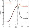
Fig. 6
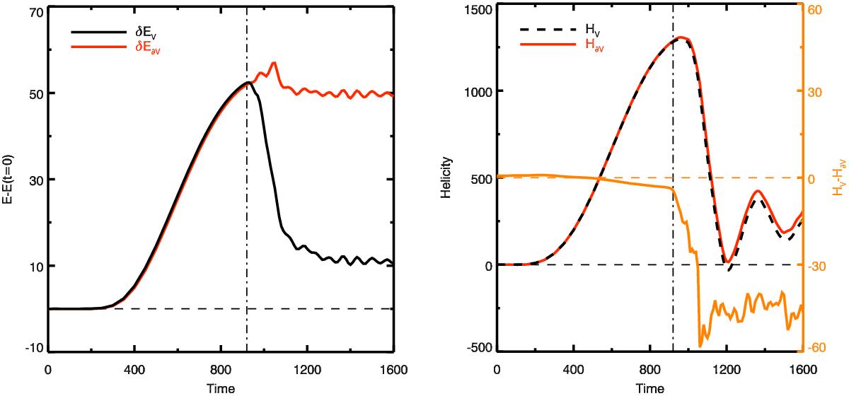
Left panel: comparison of the evolution of magnetic energy (![]() , black line) in the volume with the time integration of the Poynting flux through the whole surface of the domain (
, black line) in the volume with the time integration of the Poynting flux through the whole surface of the domain (![]() , red line). Right panel: comparison of the evolution of helicity obtained by volume integration (
, red line). Right panel: comparison of the evolution of helicity obtained by volume integration (![]() , black dashed line) with the time integration of the helicity flux through the whole surface of the domain (
, black dashed line) with the time integration of the helicity flux through the whole surface of the domain (![]() , red line), computed with the practical DeVore gauge. Their difference is plotted in orange on a different range of amplitude (cf. right axis).
, red line), computed with the practical DeVore gauge. Their difference is plotted in orange on a different range of amplitude (cf. right axis).
Current usage metrics show cumulative count of Article Views (full-text article views including HTML views, PDF and ePub downloads, according to the available data) and Abstracts Views on Vision4Press platform.
Data correspond to usage on the plateform after 2015. The current usage metrics is available 48-96 hours after online publication and is updated daily on week days.
Initial download of the metrics may take a while.