Fig. 13
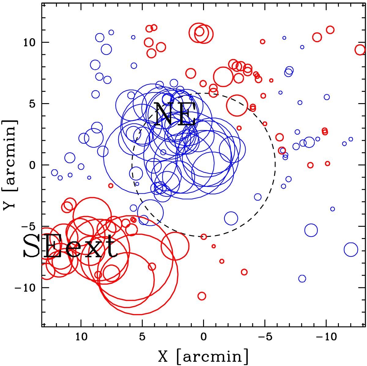
DS⟨V⟩ bubble-plot for the ELG population. The larger the circle, the larger is the deviation of the local mean velocity from the global mean velocity. Blue and heavy red circles show where the local value of mean velocity is smaller or larger than the global value. Labels indicate the two peaks detected in the 2D analysis (see Table 6 and Fig. 11, lower right panel). The R200 region is highlighted by the large black dashed circle centered on the BCG.
Current usage metrics show cumulative count of Article Views (full-text article views including HTML views, PDF and ePub downloads, according to the available data) and Abstracts Views on Vision4Press platform.
Data correspond to usage on the plateform after 2015. The current usage metrics is available 48-96 hours after online publication and is updated daily on week days.
Initial download of the metrics may take a while.