Fig. 7
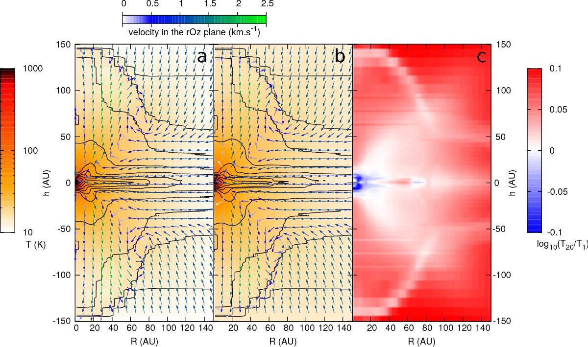
a) Temperature map (colours) at a time t = 24 282 yr in a grey simulation of the collapse of a 1 M⊙ cloud. The data are presented as a function of radius and height over the mid-plane; the data have been averaged around the azimuthal direction. The black lines are logarithmically spaced density contours, in the range 10-16<ρ< 10-9 g cm-3 (two contours per order of magnitude). The arrows represent the velocity vector field in the r-z plane. b) Same as for a) but using 20 frequency groups. c) Map of the logarithm of the ratio of the multigroup temperature over the grey temperature. The colour red indicates where the gas temperature in the multigroup simulation is higher than for the grey run, and vice versa for blue.
Current usage metrics show cumulative count of Article Views (full-text article views including HTML views, PDF and ePub downloads, according to the available data) and Abstracts Views on Vision4Press platform.
Data correspond to usage on the plateform after 2015. The current usage metrics is available 48-96 hours after online publication and is updated daily on week days.
Initial download of the metrics may take a while.