Fig. 6
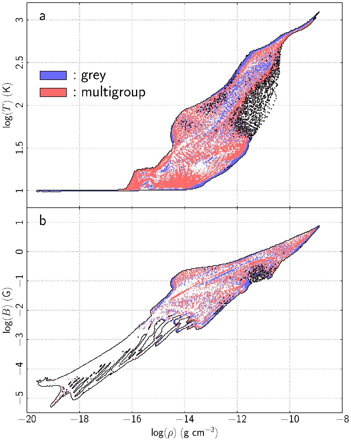
a) Temperature as a function of density in the grey and multigroup simulations at a time t = 24 265 yr. The colour blue represents regions where the grey simulation either dominates (in terms of mass contained within the figure pixels) over the multigroup simulation, or where there is no multigroup data. Likewise, red codes for the regions of the diagram where the multigroup run prevails. The white areas indicate where both simulations yield identical results. The black contour line delineates the region where data are present. b) Same as for a) but showing the strength of the magnetic field as a function of density.
Current usage metrics show cumulative count of Article Views (full-text article views including HTML views, PDF and ePub downloads, according to the available data) and Abstracts Views on Vision4Press platform.
Data correspond to usage on the plateform after 2015. The current usage metrics is available 48-96 hours after online publication and is updated daily on week days.
Initial download of the metrics may take a while.