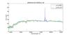
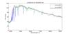
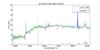
Fig. 7

Three most extreme outliers obtained from our regression model. The green line in the background is the SDSS spectrum with the gray spectrum at the bottom being the typical noise deviation. The red curve shows the fitted spectrum with a redshift as obtained by SDSS, the blue curve is the overplotted spectrum with the redshift as obtained by our regression model.
Current usage metrics show cumulative count of Article Views (full-text article views including HTML views, PDF and ePub downloads, according to the available data) and Abstracts Views on Vision4Press platform.
Data correspond to usage on the plateform after 2015. The current usage metrics is available 48-96 hours after online publication and is updated daily on week days.
Initial download of the metrics may take a while.