Fig. B.2
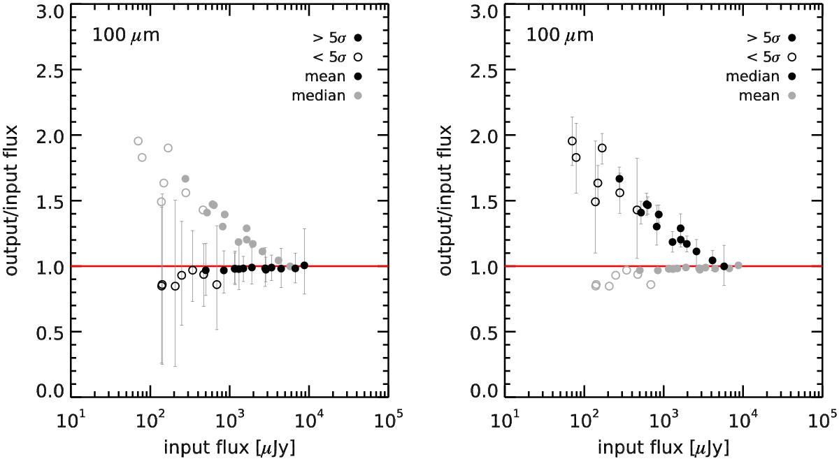
Comparison of measured stacked flux densities from the simulated images with the real flux densities that were put into the 100 μm map (the other wavelengths behave the same). The stacked sources were binned in redshift and mass using exactly the same bins as those that were used to analyze the real images. Left: mean stacked flux densities, right: median stacked flux densities. Each point shows the median Soutput/Sinput among all the 400 realizations, while error bars show the 16th and 84th percentiles of the distribution. Filled circles indicate measurements that are individually significant at >5σ on average, i.e., those we would actually use, while open circles indicate measurements at <5σ to illustrate the trend. On each plot, gray circles show the values obtained with the other method (i.e., median and mean) for the sake of direct comparison. It is clear that mean fluxes are more noisy, while median fluxes exhibit a systematic bias.
Current usage metrics show cumulative count of Article Views (full-text article views including HTML views, PDF and ePub downloads, according to the available data) and Abstracts Views on Vision4Press platform.
Data correspond to usage on the plateform after 2015. The current usage metrics is available 48-96 hours after online publication and is updated daily on week days.
Initial download of the metrics may take a while.