Fig. A.3
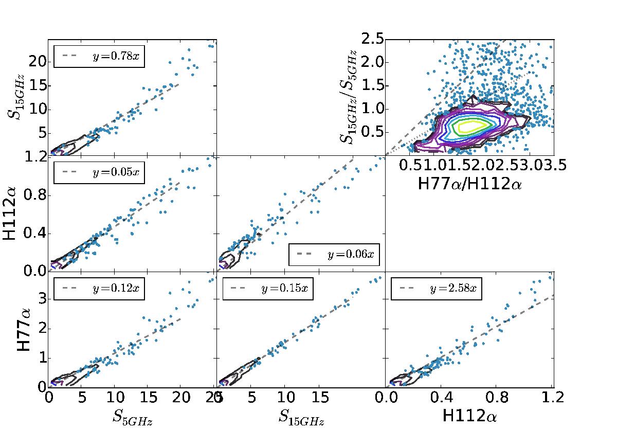
5 GHz and 15 GHz continuum and RRL flux densities against one another; all units are in Jy. The dashed lines show the total least squares best fit line with the slope shown in the legend. Wherever the density of points is too high to display, the points have been replaced with a contour plot showing the density of data points. The upper-right panel shows a comparison of the continuum ratio to the RRL ratio. The dashed line in the upper-right plot has slope 1, and the dotted line has slope 0.6.
Current usage metrics show cumulative count of Article Views (full-text article views including HTML views, PDF and ePub downloads, according to the available data) and Abstracts Views on Vision4Press platform.
Data correspond to usage on the plateform after 2015. The current usage metrics is available 48-96 hours after online publication and is updated daily on week days.
Initial download of the metrics may take a while.