Fig. 3
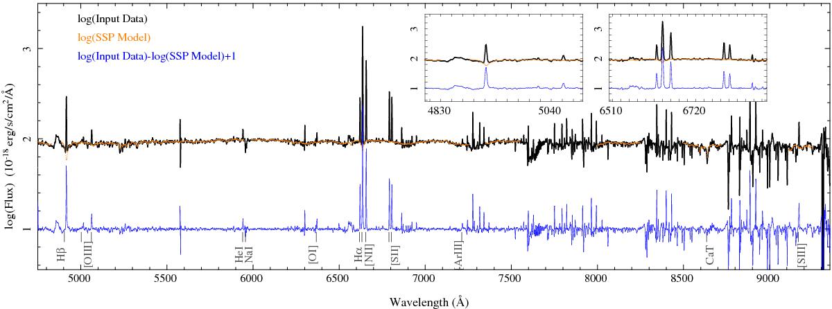
Detail of the spectrum of a typical H ii region extracted from the galaxy. The black line shows the input spectrum in logarithmic scale, together with the best fitted stellar model in orange. The difference between the logarithms of the input spectrum and the model, shifted by 1, is shown as a blue line. The intensities of the emission lines are so high that the spectra are plotted in logarithmic scale to show them together with the detail of the underlying stellar population.The most prominent spectral features discussed throughout the article are marked. The spectral regions masked during the fitting of the underlying stellar population are not shown by the orange solid line. The two boxes show an expanded view around Hβ and Hα.
Current usage metrics show cumulative count of Article Views (full-text article views including HTML views, PDF and ePub downloads, according to the available data) and Abstracts Views on Vision4Press platform.
Data correspond to usage on the plateform after 2015. The current usage metrics is available 48-96 hours after online publication and is updated daily on week days.
Initial download of the metrics may take a while.