Fig. 4
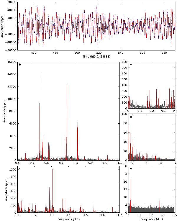
Upper panel: zoom-in section showing approximately 1/10th of the reduced Kepler light curve (blue dots, brightest at the top) of KIC 10526294, and the residuals (grey dots) after prewhitening with a model (red solid line) constructed using all model frequencies – see text for further explanation. Lower panels from a) to e) The Scargle periodogram of the full Kepler light curve (grey solid line) showing the 346 significant frequencies (red vertical lines). For clarity reasons, the full frequency range is cut into five different parts, and the signal from outside the plotted ranges is prewhitened for each panel. Note the different scales utilised for these panels.
Current usage metrics show cumulative count of Article Views (full-text article views including HTML views, PDF and ePub downloads, according to the available data) and Abstracts Views on Vision4Press platform.
Data correspond to usage on the plateform after 2015. The current usage metrics is available 48-96 hours after online publication and is updated daily on week days.
Initial download of the metrics may take a while.