Fig. 14
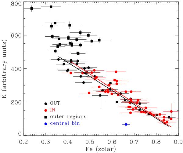
Entropy – Fe abundance correlation. Red marks the IN polygons, black marks the OUT polygons. The red and black lines are the best fits for IN and OUT points, respectively. The best fits have been derived using the BCES estimator after excluding the outermost regions (black squares) and the spectrally complex central bin (blue point).
Current usage metrics show cumulative count of Article Views (full-text article views including HTML views, PDF and ePub downloads, according to the available data) and Abstracts Views on Vision4Press platform.
Data correspond to usage on the plateform after 2015. The current usage metrics is available 48-96 hours after online publication and is updated daily on week days.
Initial download of the metrics may take a while.