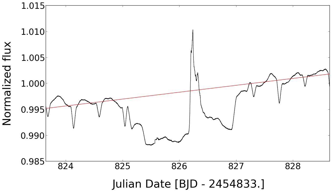
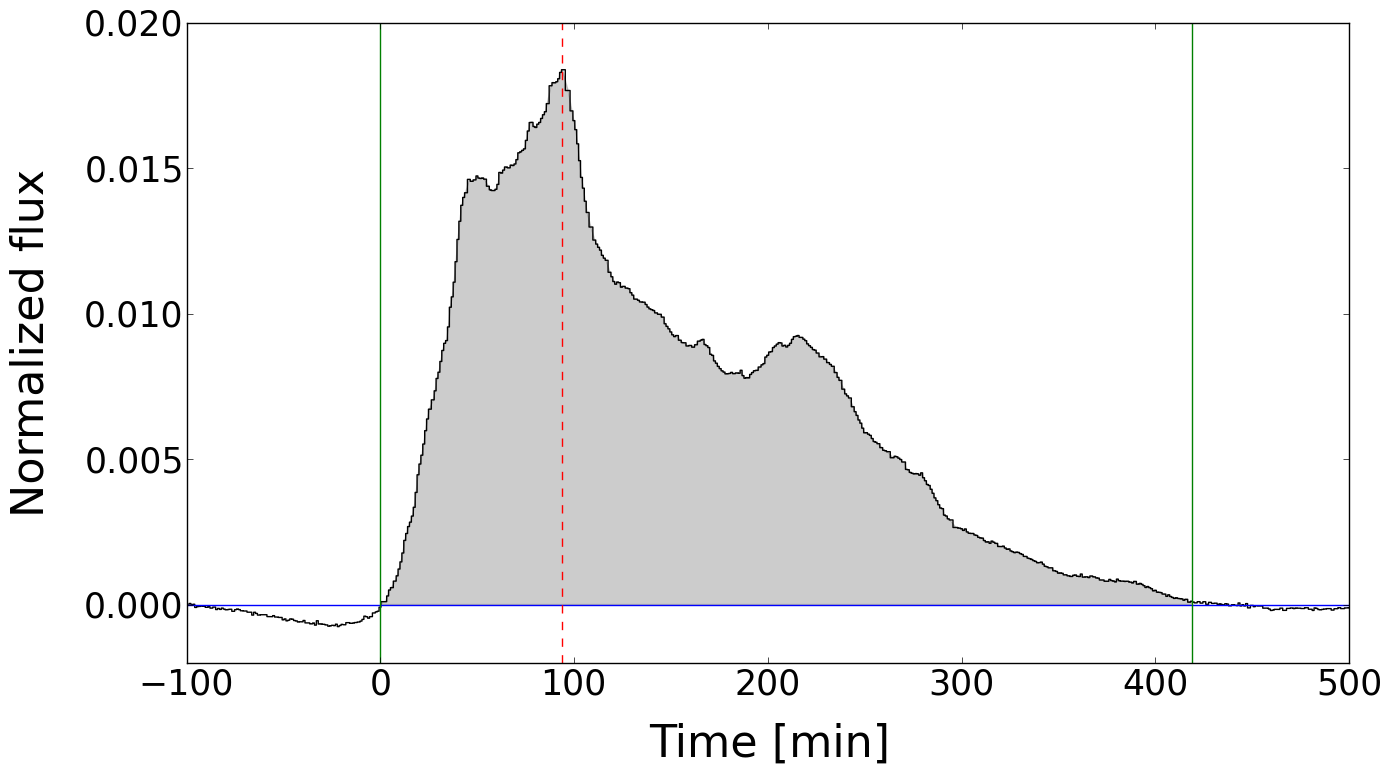
Fig. 4
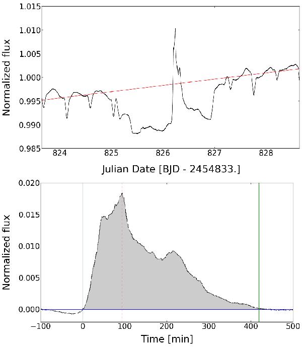
White-light flare observed during secondary eclipse (first flare listed in Table 7). Upper panel: Kepler light curve of the secondary eclipse covering the flare. The red line shows the continuum normalization of the transit. Lower panel: normalized flare light curve. Vertical solid (green) lines indicate the start and end of the flare and the dashed (red) line marks the time of maximum flux.
Current usage metrics show cumulative count of Article Views (full-text article views including HTML views, PDF and ePub downloads, according to the available data) and Abstracts Views on Vision4Press platform.
Data correspond to usage on the plateform after 2015. The current usage metrics is available 48-96 hours after online publication and is updated daily on week days.
Initial download of the metrics may take a while.