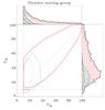
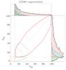
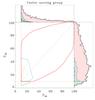
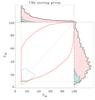
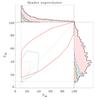
Fig. 5

Comparison of the probability P2D relative to P3D in the case of the member sample of each MG. On the lower left box of each panel, the solid red, long-dashed blue, dotted orange, and dash-dotted green lines delimit the areas of sources whose classifications from our two methods are in full agreement, possible agreement, possible disagreement, and complete disagreement, respectively. This corresponds to the membership categories “G”, “P”, “U”, and “N” (Table 2). The membership thresholds of both procedures (vertical and horizontal lines) and the one-to-one relation (dashed gray line) are shown as well. In each of the five panels, we plot the histograms of the probabilities P3D(top box) and P2D(right box) with a bin size of 2% using the same color code.
Current usage metrics show cumulative count of Article Views (full-text article views including HTML views, PDF and ePub downloads, according to the available data) and Abstracts Views on Vision4Press platform.
Data correspond to usage on the plateform after 2015. The current usage metrics is available 48-96 hours after online publication and is updated daily on week days.
Initial download of the metrics may take a while.