Fig. 7
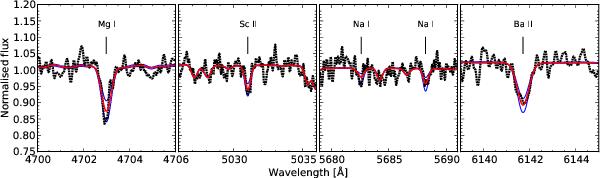
Example fits to individual features. The dotted black curves show the observed spectrum of the WLM GC, while the thick solid curves (red in the online version) are the best-fitting model spectra for the wavelength bins shown in the figure. The thin curves (blue in the online edition) show models where the abundances of the corresponding elements have been varied by ± 0.3 dex. The spectra have been smoothed by a Gaussian kernel with σ = 1.5 pixels.
Current usage metrics show cumulative count of Article Views (full-text article views including HTML views, PDF and ePub downloads, according to the available data) and Abstracts Views on Vision4Press platform.
Data correspond to usage on the plateform after 2015. The current usage metrics is available 48-96 hours after online publication and is updated daily on week days.
Initial download of the metrics may take a while.