Fig. 4
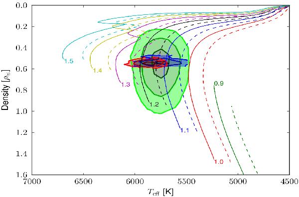
Mean stellar density versus Teff diagram. The colored areas correspond to the values derived from (i) in green, the spectroscopic analysis, the log g being converted into mean density; (ii) in blue, the atmospheric parameters derived from the spectroscopic analysis combined with the mean stellar density from the transit fitting; (iii) in red, the best model obtained by modeling the SED, the light curve, and the radial velocity measurements. The contours correspond to the 1σ, 2σ, and 3σ regions. The curves are STAREVOL stellar evolutionary tracks plotted for a few masses as labeled, and for each mass with two different metallicities: 0.2 (solid line) and 0.3 (dashed line).
Current usage metrics show cumulative count of Article Views (full-text article views including HTML views, PDF and ePub downloads, according to the available data) and Abstracts Views on Vision4Press platform.
Data correspond to usage on the plateform after 2015. The current usage metrics is available 48-96 hours after online publication and is updated daily on week days.
Initial download of the metrics may take a while.