Fig. 10
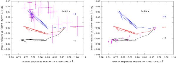
Left: diagnostic diagram based on the simultaneous use of the normalised amplitudes and normalised phases for the 145.8 s mode. The crosses refer to the observational data, while the curves refer to model predictions for ℓ = 0 (black), ℓ = 1 (red), and ℓ = 2 (blue). Right: similar to the left panel, but referring to the dominant 140.5 s mode.
Current usage metrics show cumulative count of Article Views (full-text article views including HTML views, PDF and ePub downloads, according to the available data) and Abstracts Views on Vision4Press platform.
Data correspond to usage on the plateform after 2015. The current usage metrics is available 48-96 hours after online publication and is updated daily on week days.
Initial download of the metrics may take a while.