Fig. 3
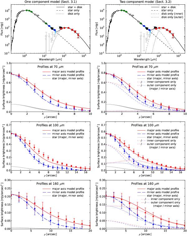
Observed SED and radial profiles plotted along with simulated data from our one-component (left column) and two-component best-fit models (right column). In the SED plots, red data points are our new Herschel data, the light blue line represents the available Spitzer/IRS spectrum, blue points represent synthetic photometry extracted from this spectrum in order to consider them for the model fitting, gray points illustrate the photosphere subtracted photometry longward of 10 μm, and remaining points are ancillary data from the literature. Green points represent the data used for the normalization of the stellar spectrum. Data longward of 10 μm have been considered for the disk model fitting. In the radial profile plots, the thick black line represents the stellar contribution (an observation of the PSF reference star α Boo scaled to the stellar flux of HIP 17439), with its width representing the difference between major axis and minor axis. The remaining lines represent the model data and points with uncertainties represent the observed profiles. The major axis is plotted in red, the minor axis in blue. In the right column showing the results for the two-component fit, dotted lines illustrate the contribution of the two-components (inner/warm and outer/cold).
Current usage metrics show cumulative count of Article Views (full-text article views including HTML views, PDF and ePub downloads, according to the available data) and Abstracts Views on Vision4Press platform.
Data correspond to usage on the plateform after 2015. The current usage metrics is available 48-96 hours after online publication and is updated daily on week days.
Initial download of the metrics may take a while.