Fig. 11
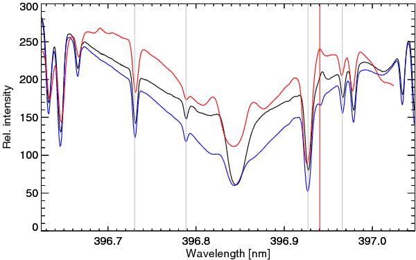
Comparison of the mean position of the Fe II line. The thick black curve is the mean of the line profiles with a 3% emission of the Fe II line; the lower curve is the average of all line profiles of our data set; and the upper curve is a spatial average of the same spectral region observed close to the solar limb. The grey vertical lines indicate the spectral lines used to align the wavelength scale of the limb profile. The vignetting of the limb profile is caused by the prefilter. The red vertical line shows the position of the Fe II absorption line at disk center, as well as that of the Fe II emission line at the limb. The redshift of the Fe II emission line at disk center is clearly visible.
Current usage metrics show cumulative count of Article Views (full-text article views including HTML views, PDF and ePub downloads, according to the available data) and Abstracts Views on Vision4Press platform.
Data correspond to usage on the plateform after 2015. The current usage metrics is available 48-96 hours after online publication and is updated daily on week days.
Initial download of the metrics may take a while.