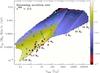
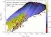
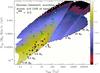
Fig. 5
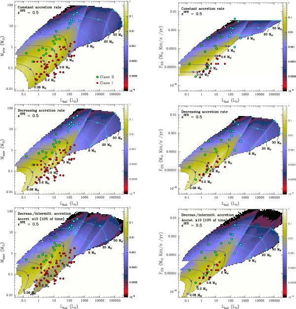
Left column: Envelope mass with respect to the bolometric luminosity. Right column: Fco with respect to bolometric luminosity. The top row shows the model with constant accretion rate over time, the middle row shows the model with decreasing accretion rate, and the bottom panels present the model with decreasing accretion rates and intermittent accretion. For all panels, the dotted curves show the evolutionary tracks for 0.08, 0.2, 0.6, 2, 8, 20, and 50 M⊙, and the arrows show the positions in each track where 50% and 90% of the envelope mass has been accreted onto the protostar. The coloured area represents a normalised surface density of the number of sources predicted to be at a given position, by taking the IMF distribution and the timescales of the evolutionary tracks into account. The massive protostars studied here are in light blue circles. The sources from Bontemps et al. (1996) and André et al. (2000) are plotted as green- and red-filled circles (for Class 0 and Class I, respectively).
Current usage metrics show cumulative count of Article Views (full-text article views including HTML views, PDF and ePub downloads, according to the available data) and Abstracts Views on Vision4Press platform.
Data correspond to usage on the plateform after 2015. The current usage metrics is available 48-96 hours after online publication and is updated daily on week days.
Initial download of the metrics may take a while.