Fig. 8
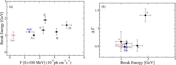
a) Break energy plotted as a function of flux for the different activity periods. b) Change of the spectral slope ΔΓ as a function of break energy. In both plots, the squares represent the high-activity period, the diamonds the low-activity period, and the circles are the individual flares during the high-activity period.
Current usage metrics show cumulative count of Article Views (full-text article views including HTML views, PDF and ePub downloads, according to the available data) and Abstracts Views on Vision4Press platform.
Data correspond to usage on the plateform after 2015. The current usage metrics is available 48-96 hours after online publication and is updated daily on week days.
Initial download of the metrics may take a while.