Fig. 3
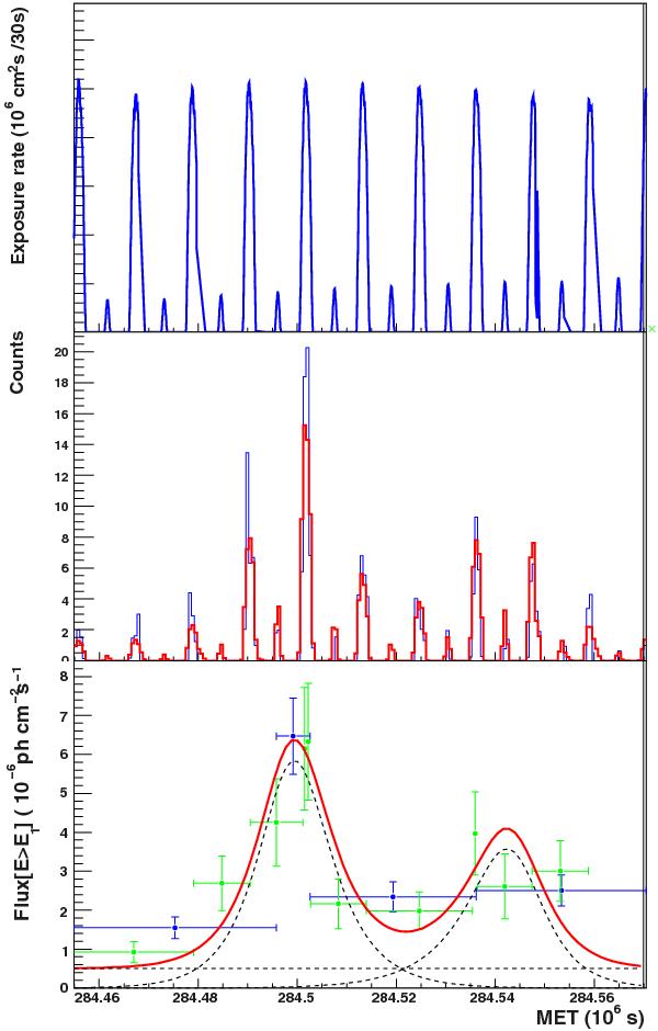
Top: exposure rate during flare D. Middle: predicted (red) and observed (blue) source photon detection rates. Bottom: photon flux light curve of flare D. The red curve shows the results of the time-domain-unbinned analysis, and the blue (15%) and green (25%) symbols represent the adaptive-binning analysis results.
Current usage metrics show cumulative count of Article Views (full-text article views including HTML views, PDF and ePub downloads, according to the available data) and Abstracts Views on Vision4Press platform.
Data correspond to usage on the plateform after 2015. The current usage metrics is available 48-96 hours after online publication and is updated daily on week days.
Initial download of the metrics may take a while.