Fig. 10
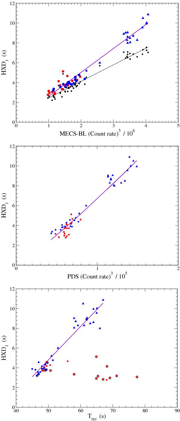
Upper panel: correlation between the HXD1, evaluated using the direct method, with the third power of the mean count rate of the BL (in units of 106). Blue circles correspond to the interval I series, blue triangles to the interval III series; red filled squares correspond to the series in interval II. The solid thick violet line indicates the linear best fit. Black circles and the thin black line are data points for the CCF estimates of HXD and their best fit. Central panel: correlation between the mean HXDs with the mean count rate in the PDS band (units of 105). Symbols are the same as in the upper panel. Lower panel: correlation between the mean HXD1 with the recurrence time of bursts as evaluated in Paper I. The solid thick line is the linear best fit of blue points only. Black circled points mark the irregular data series.
Current usage metrics show cumulative count of Article Views (full-text article views including HTML views, PDF and ePub downloads, according to the available data) and Abstracts Views on Vision4Press platform.
Data correspond to usage on the plateform after 2015. The current usage metrics is available 48-96 hours after online publication and is updated daily on week days.
Initial download of the metrics may take a while.