Fig. 20
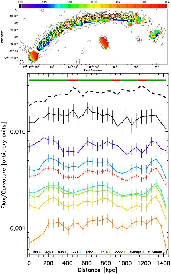
Top: areas selected for measuring the spectral curvature and flux. Bottom: fluxes with error bars measured within the circular regions for seven frequencies 153 MHz to 2272 MHz. The x-axis measured distance along the relic measured in kpc from the first region to the east, towards west. The curves in solid lines represent increasing frequency from top to bottom. Average fluxes between 323 MHz and 1714 MHz are overplotted in a dashed red line. The curvature within the same regions is plotted in a dashed black line. The curvature values were shifted along the y-axis for plotting reasons and stretched for clarity. The colours in the solid line at the top of the plot indicate the level of confidence for the flux trends: red correlates to a noise dominated measurement, while green represents trustworthy measurements.
Current usage metrics show cumulative count of Article Views (full-text article views including HTML views, PDF and ePub downloads, according to the available data) and Abstracts Views on Vision4Press platform.
Data correspond to usage on the plateform after 2015. The current usage metrics is available 48-96 hours after online publication and is updated daily on week days.
Initial download of the metrics may take a while.