Fig. 10
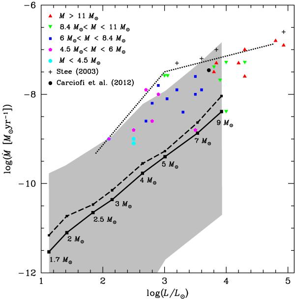
Mass loss – luminosity diagram. The colour points correspond to data by Waters et al. (1987), while the black crosses correspond to data from Stee (2003) and the black circle to the data from Carciofi et al. (2012) for 28 CMa. The thin dotted curve traces the upper limit for IR mass-loss rates obtained by Waters et al. (1987). The thick black curve corresponds to the mean mechanical mass-loss rates along the critical rotation phase, obtained as described in Sect. 4 and shown in Table 1, while the dashed black line corresponds to the mean value during the time in which the star is effectively losing mass. The grey region corresponds to the range of instantaneous mass-loss rates.
Current usage metrics show cumulative count of Article Views (full-text article views including HTML views, PDF and ePub downloads, according to the available data) and Abstracts Views on Vision4Press platform.
Data correspond to usage on the plateform after 2015. The current usage metrics is available 48-96 hours after online publication and is updated daily on week days.
Initial download of the metrics may take a while.