Fig. 5
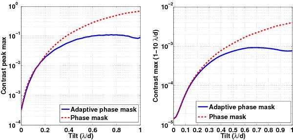
The curves represent the contrast obtained on the peak (left plot) or from the first to the tenth rings (right plot) for a perfect static phase mask (red curve) or for the APM (blue curve). The red curve represents the variation in the contrast without any control of transmission outside of the phase mask (it corresponds to the cut of top line of the Fig. 4). The blue curve illustrates the contrast achieved by the control of transmission with an increasing tilt. The APM is more efficient over the rings where the contrast is needed, and it maintains the contrast bellow 10-3 with a tilt of λ/D. It should be noted that the red curves are obtained for a purely achromatic phase mask whose diameter perfectly matches the theoretical diameter balancing the amplitudes of the interfering waves. Any practical implementation in a real environment would show a worse contrast, especially for small tilts.
Current usage metrics show cumulative count of Article Views (full-text article views including HTML views, PDF and ePub downloads, according to the available data) and Abstracts Views on Vision4Press platform.
Data correspond to usage on the plateform after 2015. The current usage metrics is available 48-96 hours after online publication and is updated daily on week days.
Initial download of the metrics may take a while.