Fig. 8
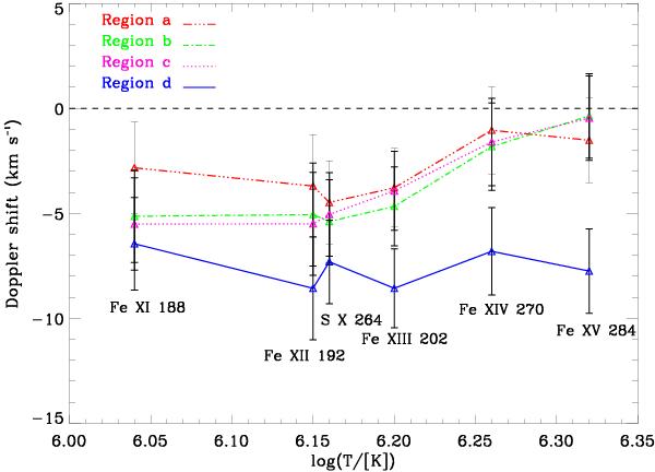
Average Doppler shift of hot coronal lines in different regions defined in the left panel of Fig. 7, plotted as a function of formation temperature. Fe xii and S x have nearly the same formation temperature, but are plotted a bit separated for better readability. Positive and negative values of velocity represent downflows (red shifts) and upflows (blue shifts), respectively.
Current usage metrics show cumulative count of Article Views (full-text article views including HTML views, PDF and ePub downloads, according to the available data) and Abstracts Views on Vision4Press platform.
Data correspond to usage on the plateform after 2015. The current usage metrics is available 48-96 hours after online publication and is updated daily on week days.
Initial download of the metrics may take a while.