Fig. 6
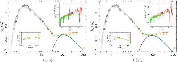
SED of the cold disk model. The left-hand figure shows the best fit to the three PACS images only ( , Table 3). The right-hand figure shows the best fit to both the three PACS images and the IRS spectrum
  . The modeled cold dust emission is the blue curve, the Next Gen stellar atmosphere spectrum is the gray curve, and their sum is the green curve. The IRS spectrum is in red. The upper inset zooms on the IRS wavelengths and displays spectra as Sν × (λ/24)2 on a linear scale for clarity. The lower inset zooms on the three PACS bands. In the left-hand figure, the best fit model satisfactorily fits the PACS data as shown by the lower inset but misses the IRS data as shown by the upper inset. In the right-hand figure, the best fit model partially misses the PACS data but satisfactorily fits the IRS data.
Current usage metrics show cumulative count of Article Views (full-text article views including HTML views, PDF and ePub downloads, according to the available data) and Abstracts Views on Vision4Press platform.
Data correspond to usage on the plateform after 2015. The current usage metrics is available 48-96 hours after online publication and is updated daily on week days.
Initial download of the metrics may take a while.