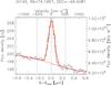
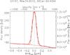
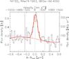
Fig. 3
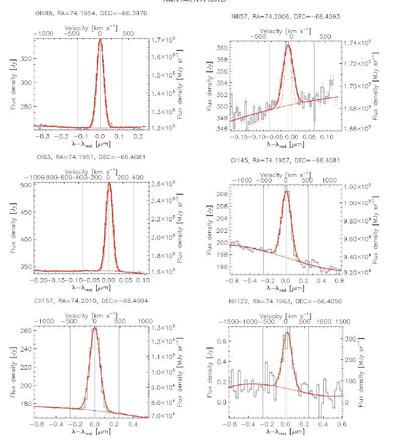
Line fits are shown for one spaxel observing the W2 region. The histogram shows the rebinned data, the thin curve shows the continuum, and the thick curve shows the fit. The fit was performed on the data cloud, which contains ≈ 140 000 points. We show the rebinned spectrum for display purposes.
Current usage metrics show cumulative count of Article Views (full-text article views including HTML views, PDF and ePub downloads, according to the available data) and Abstracts Views on Vision4Press platform.
Data correspond to usage on the plateform after 2015. The current usage metrics is available 48-96 hours after online publication and is updated daily on week days.
Initial download of the metrics may take a while.