Fig. 4
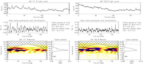
Wavelet plots for the time series from the row marked by the dashed line in Fig. 3 in 171 Å (left) and 193 Å channels. In each of these figures top panels show the original light curve in solid line and the subtracted trend in dashed line. The middle panels display the trend subtracted and normalized light curves. The main wavelet plot is shown in the bottom left and the global wavelet plot in the bottom right panels. Overplotted dotted line in the global wavelet plot is the 99% significance curve. Top two strongest significant periods are listed as P1 and P2 in the middle right portion.
Current usage metrics show cumulative count of Article Views (full-text article views including HTML views, PDF and ePub downloads, according to the available data) and Abstracts Views on Vision4Press platform.
Data correspond to usage on the plateform after 2015. The current usage metrics is available 48-96 hours after online publication and is updated daily on week days.
Initial download of the metrics may take a while.