Fig. 4
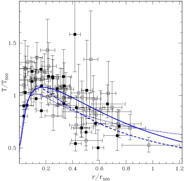
Normalized temperature profiles for all clusters in the sample. CC clusters are plotted with filled squares, while NCC clusters are shown as open squares (see Sect. 4.2.1). The best fit to the Vikhlinin et al. (2006) relation, freeing the normalization, is drawn as a blue solid line. The blue dotted line represents the best fit to the relation in Eq. (3) (with ξ0 = 0.45), while the blue dashed line is the best fit of Eq. (5) for r > 0.15r500.
Current usage metrics show cumulative count of Article Views (full-text article views including HTML views, PDF and ePub downloads, according to the available data) and Abstracts Views on Vision4Press platform.
Data correspond to usage on the plateform after 2015. The current usage metrics is available 48-96 hours after online publication and is updated daily on week days.
Initial download of the metrics may take a while.