Fig. 15
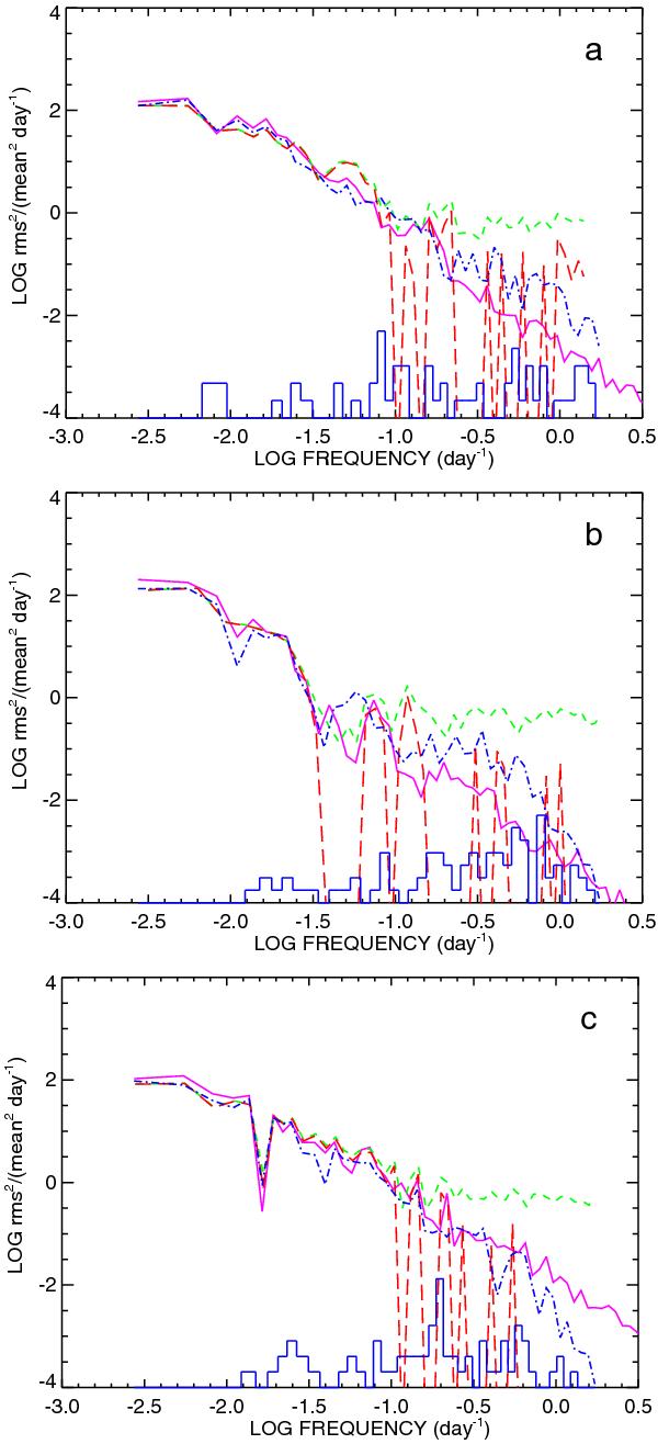
Comparison of power density spectra for the same simulations as in Fig. 1. In each plot the solid curve (purple) is the PDS of the true light curve. The dashed (green) and long dashed (red) curves are the PDS calculated for the fixed binned light curves, the white noise level being subtracted for the latter. The PDS of the adaptive binned light curve is plotted as a dash-dot curve. All PDS curves were smoothed by averaging over logarithmic frequency bins. The distribution of Nyquist frequencies corresponding to the time widths of the adaptive bins is shown by the histogram (blue). Note that this distribution is plotted in linear scale, the zero level corresponding to the lower limit of the vertical axis.
Current usage metrics show cumulative count of Article Views (full-text article views including HTML views, PDF and ePub downloads, according to the available data) and Abstracts Views on Vision4Press platform.
Data correspond to usage on the plateform after 2015. The current usage metrics is available 48-96 hours after online publication and is updated daily on week days.
Initial download of the metrics may take a while.