Fig. 3
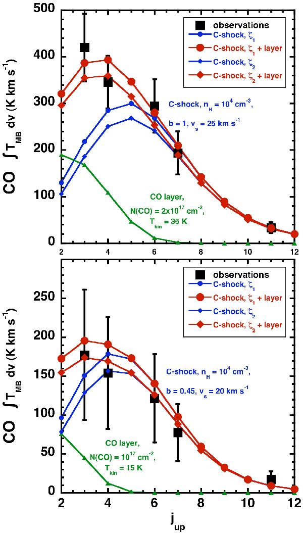
Best-model comparisons between CO observations and models for each observed shock: the blue- (upper panel) and the red- (lower panel) components. Observations are marked by the black squares, our individual best-shock models are in blue line and circles (ζ1) or diamonds (ζ2), the warm layer that we used to compensate the ambient emission affecting the (3–2) and (4–3) transitions in green line and triangles, and the sum of each of these components is represented by a red line and circles or diamonds.
Current usage metrics show cumulative count of Article Views (full-text article views including HTML views, PDF and ePub downloads, according to the available data) and Abstracts Views on Vision4Press platform.
Data correspond to usage on the plateform after 2015. The current usage metrics is available 48-96 hours after online publication and is updated daily on week days.
Initial download of the metrics may take a while.