Fig. 2
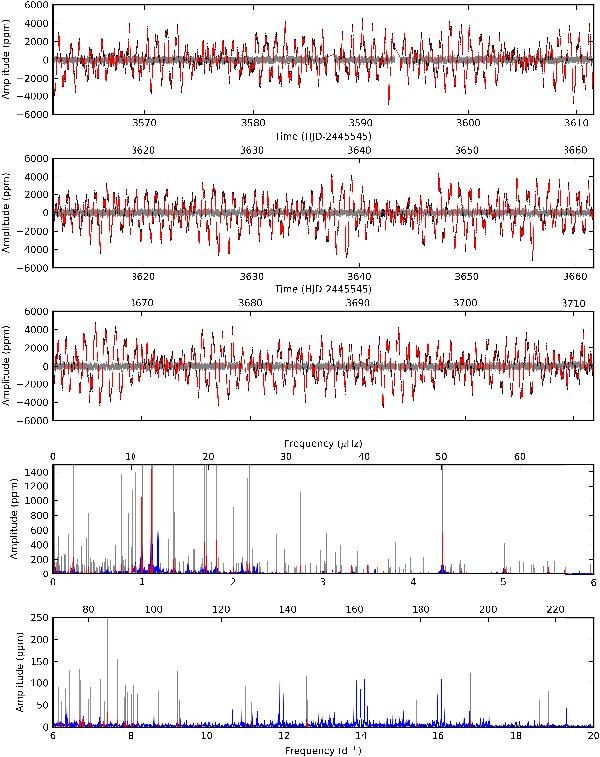
Upper three panels: the reduced CoRoT light curve (black dots, brightest at the top) and residuals (grey dots) after prewhitening with a model (red solid line) constructed using the set of 424 frequencies listed in Table A.1 – see text for further explanation. Lower two panels: the Scargle periodogram of the full CoRoT light curve (blue solid line) showing the 424 frequencies (red vertical lines). For better visibility, the red lines are repeated in grey in the background, after multiplying their amplitude with a factor ten. Aliases of the strongest peaks around ~1 d-1 due to the satellite orbital motion can be seen around 12, 14 and 16 d-1.
Current usage metrics show cumulative count of Article Views (full-text article views including HTML views, PDF and ePub downloads, according to the available data) and Abstracts Views on Vision4Press platform.
Data correspond to usage on the plateform after 2015. The current usage metrics is available 48-96 hours after online publication and is updated daily on week days.
Initial download of the metrics may take a while.