Fig. 3
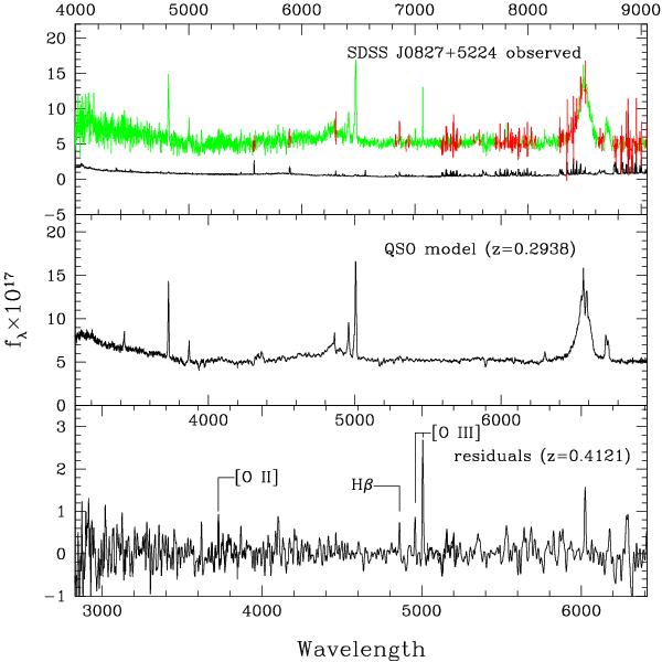
Example of a spectral principal component analysis of a SDSS spectrum. Top: SDSS spectrum of SDSS J0827+5224 along with the 1σ errors (black). The spectrum is shown in the observed frame, labeled on the upper axis. The red points are those flagged as bad in the SDSS archive, typically because of poor sky subtraction. Middle: model of this spectrum, computed using the 43 most significant eigenspectra derived from 1000 high signal-to-noise spectra from the SDSS archive. The model is plotted against rest wavelength of the QSO, labeled below the lower boundary of this panel. Bottom: subtraction of the model spectrum from the observed one, smoothed with a Gaussian having a full width at half maximum FWHM = 200 km s-1. The [Oii], [Oiii], and Hβ emission lines from the lensed object are labeled. This difference spectrum is plotted against rest wavelength in the frame of the lensed object. The significant peaks that are not labeled are all associated with regions of poor sky subtraction.
Current usage metrics show cumulative count of Article Views (full-text article views including HTML views, PDF and ePub downloads, according to the available data) and Abstracts Views on Vision4Press platform.
Data correspond to usage on the plateform after 2015. The current usage metrics is available 48-96 hours after online publication and is updated daily on week days.
Initial download of the metrics may take a while.