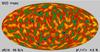
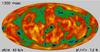
Fig. 5
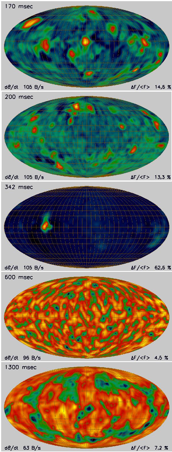
Neutrino flux asymmetry at 170 ms, 200 ms, 342 ms, 600 ms, and 1.3 s (from top to bottom), respectively. The 4π-maps show the relative angular variation ΔFo/⟨Fo⟩ of the total (i.e., sum of all neutrino flavors) neutrino energy flux density over a sphere (normalized to its angular average) for model W15-4. The maximum value is given in the lower right corner of each panel. Regions of higher emission are shown in bright yellow, while orange, red, green, and blue colors indicate successively less emission. Note that the color scale of each panel is adjusted to the maximum and minimum values at the corresponding time. The total energy loss rate due to neutrinos is given in the lower left corner.
Current usage metrics show cumulative count of Article Views (full-text article views including HTML views, PDF and ePub downloads, according to the available data) and Abstracts Views on Vision4Press platform.
Data correspond to usage on the plateform after 2015. The current usage metrics is available 48-96 hours after online publication and is updated daily on week days.
Initial download of the metrics may take a while.