Free Access
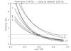
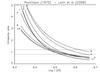
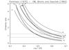
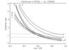
Fig. 4

Emissivity ratio curves of the strongest and most used lines in the (Parkinson 1975) active region spectrum, obtained with four different atomic datasets. The curves are numbered (see Table 1 for details). The dashed lines are plotted at ± 20%.
This figure is made of several images, please see below:
Current usage metrics show cumulative count of Article Views (full-text article views including HTML views, PDF and ePub downloads, according to the available data) and Abstracts Views on Vision4Press platform.
Data correspond to usage on the plateform after 2015. The current usage metrics is available 48-96 hours after online publication and is updated daily on week days.
Initial download of the metrics may take a while.