Fig. 4
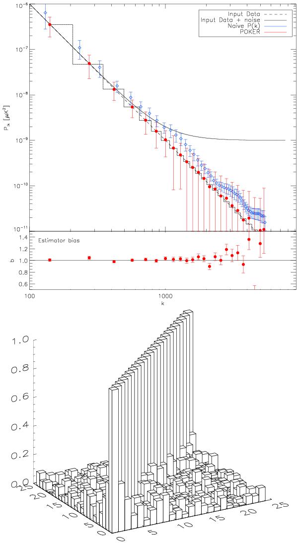
Dust (k-3). Comparison between the input theoretical power spectrum (black) and the average result of POKER (red) applied to 500 signal+noise simulations. The “naive” approach (blue, see text) is also shown for reference. Error bars in the top plots are those associated with the data (i.e. those of a single realization). The square line shows the binned theoretical power spectrum to which POKER’s average result should be compared. The bottom plots shows the ratio of the reconstructed binned power spectrum to the input theoretical binned power spectrum (the bias) and the displayed error bar is that of the average of the Monte Carlo realization (in other words: the error bar of the top plot divided by  ). These plots altogether show that POKER is unbiased. The mask used in this case is that of the top plot of Fig. 2, with 1 where data are available, 0 elsewhere.
Current usage metrics show cumulative count of Article Views (full-text article views including HTML views, PDF and ePub downloads, according to the available data) and Abstracts Views on Vision4Press platform.
Data correspond to usage on the plateform after 2015. The current usage metrics is available 48-96 hours after online publication and is updated daily on week days.
Initial download of the metrics may take a while.