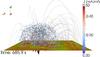
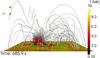
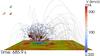
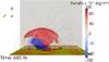
Fig. 13
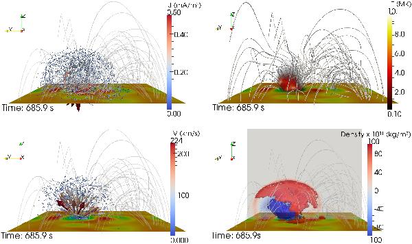
Top left – lateral view showing the distribution of the current systems at the end of the energy release phase. The arrows show the current direction, while the size and color of the arrows show the current density amplitude. Top right – lateral view of the volume distribution of the plasma temperature at the end of the energy release phase. Bottom left – lateral view of the velocity vectors at the end of the energy release phase. The arrows show the velocity direction, while the size and the color of the arrows the velocity amplitude. Bottom right – regions of density increase (red) and depletion (blue) at the end of the energy release phase. The red (blue) isosurface shows the regions where the plasma density is four times higher (lower) than the initial one. Also shown is the Z component of the magnetic field at the bottom of the simulation box and the magnetic field lines. The view is along the positive X axis.
Current usage metrics show cumulative count of Article Views (full-text article views including HTML views, PDF and ePub downloads, according to the available data) and Abstracts Views on Vision4Press platform.
Data correspond to usage on the plateform after 2015. The current usage metrics is available 48-96 hours after online publication and is updated daily on week days.
Initial download of the metrics may take a while.