Fig. 5
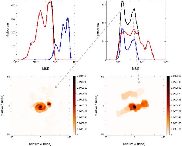
Upper row: distribution of the MSE (left) and the MSE+ (right). The colors and letters represent the two classes of objects: blue/B for the objects with very compact structures, red/C for the others. The total distribution is shown in the black/A curve. Bottom row: example of reconstructed images for the good (left) and bad (right) MSE+ peak.
Current usage metrics show cumulative count of Article Views (full-text article views including HTML views, PDF and ePub downloads, according to the available data) and Abstracts Views on Vision4Press platform.
Data correspond to usage on the plateform after 2015. The current usage metrics is available 48-96 hours after online publication and is updated daily on week days.
Initial download of the metrics may take a while.