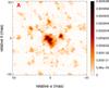
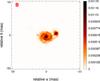
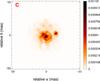
Fig. 3
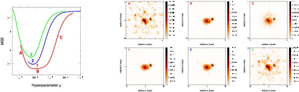
Left panel shows a plot of the MSE as a function of the hyperparameter μ. The different colors correspond to different levels of SNR (red high, blue intermediate, green poor). For each curve, the optimal value μ + is labeled by a number (1, 2, and 3). The corresponding images are shown in the bottom row of the right panel. The top row of the right panel shows three reconstructed images with different values of μ, labeled by a letter on the red curve of the left part (A an under-regularized image, B the best image, and C an over-regularized image). This example is made for the galaxy object and the medium (u,v) coverage. The regularization is the MEM-prior one.
Current usage metrics show cumulative count of Article Views (full-text article views including HTML views, PDF and ePub downloads, according to the available data) and Abstracts Views on Vision4Press platform.
Data correspond to usage on the plateform after 2015. The current usage metrics is available 48-96 hours after online publication and is updated daily on week days.
Initial download of the metrics may take a while.