Fig. 10
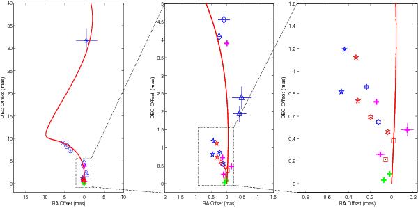
The best fitting of the precessing-jet model (red curve) to the same observed data as described in Fig. 9. The color of symbols represents the data taken at different frequencies: blue for 15 GHz or lower frequencies, magenta for 22 GHz, red for 43 GHz, and green for 86 GHz. In addition, different types of symbol mark different jet components: star for C0, cross for C1, open circle for C2, open diamond for C3, open triangle for C4, open pentagram for C5, open hexagram for C6, and open square for C7. The components (B3, B2, C, D1) from Jorstad’s paper and (A1, A2) from Lee’s paper are marked with plus signs with red and pink, respectively.
Current usage metrics show cumulative count of Article Views (full-text article views including HTML views, PDF and ePub downloads, according to the available data) and Abstracts Views on Vision4Press platform.
Data correspond to usage on the plateform after 2015. The current usage metrics is available 48-96 hours after online publication and is updated daily on week days.
Initial download of the metrics may take a while.