


Fig. B.4
Download original image
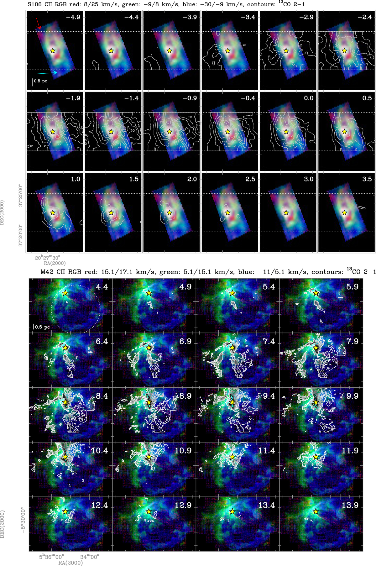
Combined RGB plot and channel map for S106 and M42. In the first M42 panel, the expanding [C II] bubble is approximated by a dotted circle. Each panel displays the distinct velocity ranges (blue and red for the high-velocity blue- and redshifted emission, green for the bulk emission) as an RGB plot with contours of 13CO(2−1) emission overlaid. The contour levels are 3 to 17 K km s−1 in steps of 2 K km s−1 for S106 and 3 to 20.5 in steps of 3.5 K km s−1for M42. The corresponding CO velocity is given in the upper-right corner. The exciting star is indicated with yellow star symbols.
Current usage metrics show cumulative count of Article Views (full-text article views including HTML views, PDF and ePub downloads, according to the available data) and Abstracts Views on Vision4Press platform.
Data correspond to usage on the plateform after 2015. The current usage metrics is available 48-96 hours after online publication and is updated daily on week days.
Initial download of the metrics may take a while.