Fig. 1.
Download original image
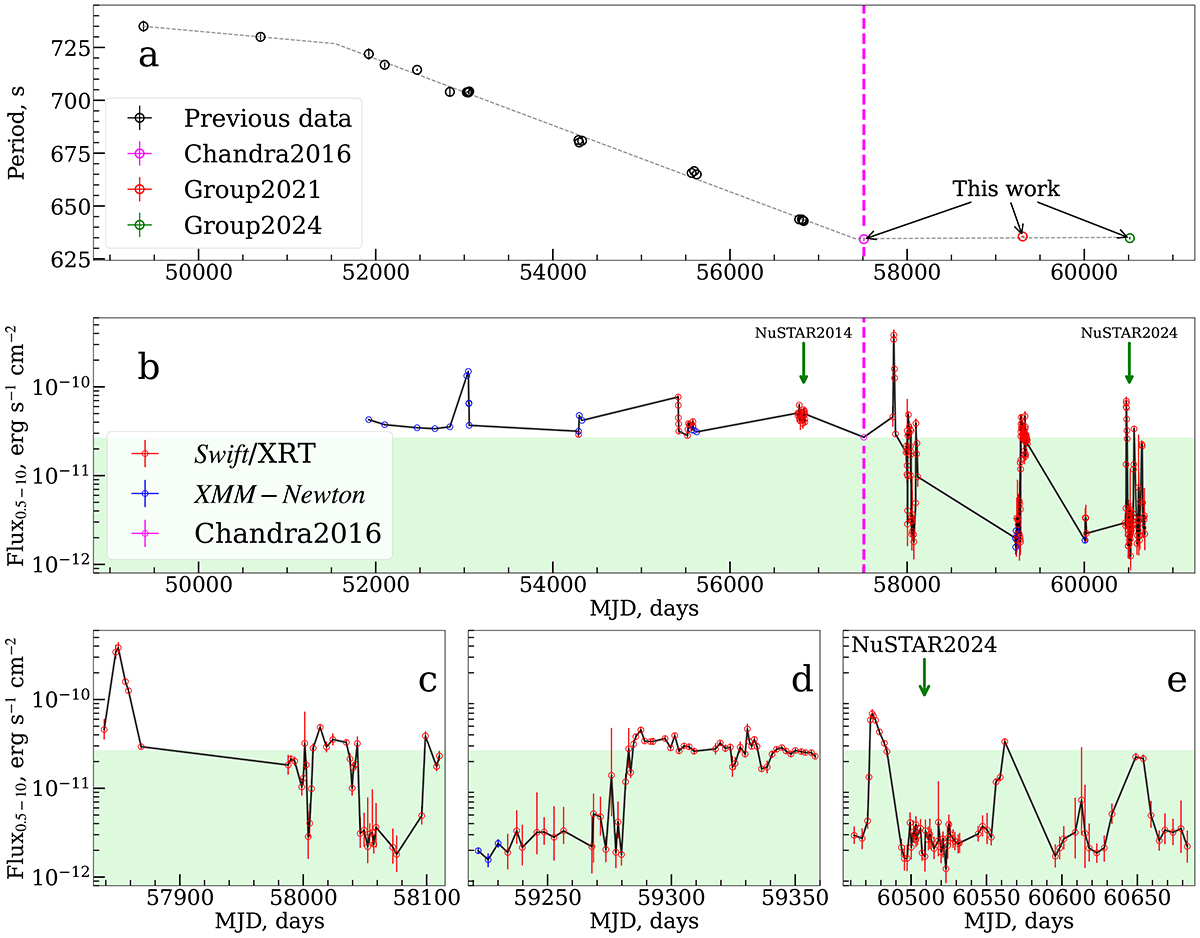
Top: Evolution of the pulse period over time (see Sect. 3.2 for details). The dotted line represents a three-piece broken curve approximation of the data points. The dashed magenta line marks the transition to the equilibrium state. Middle: Long-term 0.5−10 keV light curve of J1301. Bottom: Zoomed-in view of segments of the long-term light curve after the transition. The light green zone indicates a flux range lower than the pre-transition quiescent flux. Green arrows indicate the times of the NuSTAR observations.
Current usage metrics show cumulative count of Article Views (full-text article views including HTML views, PDF and ePub downloads, according to the available data) and Abstracts Views on Vision4Press platform.
Data correspond to usage on the plateform after 2015. The current usage metrics is available 48-96 hours after online publication and is updated daily on week days.
Initial download of the metrics may take a while.