Fig. 2
Download original image
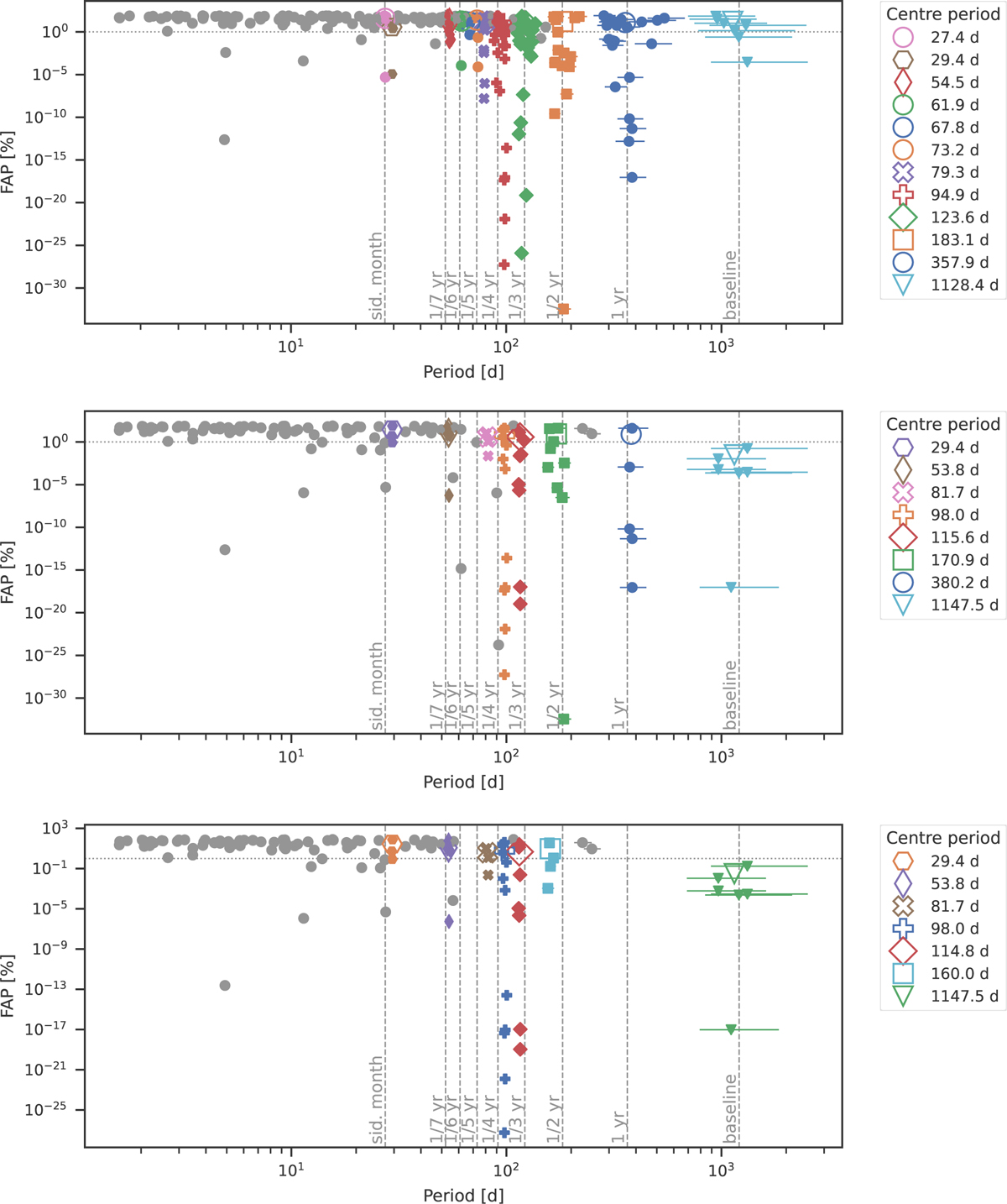
Results of the clustering algorithm for Teegarden’s Star. Top: using the naive approach. Middle: using the pre-whitening approach. Bottom: using pre-whitening and excluding periods close to the harmonics of one year. The coloured filled symbols show the individual data points of the detected clusters, with the error bars corresponding to the peak width in the GLS, and the open symbols yield the mean values of the clusters. Grey dots denote data points that were identified as noise by the clustering algorithm. The colour mapping changes between the plots to emphasise that although there is some overlap, the clusters (and thus technically also the mean periods) that appear change between the different methods. Clusters that are consistent between all plots within the GLS resolution are always denoted by the same non-circular markers. The FAP of 1% is marked by the grey horizontal dotted line and the grey vertical dashed lines show different periods of interest. The baseline indicates the timespan of the observations.
Current usage metrics show cumulative count of Article Views (full-text article views including HTML views, PDF and ePub downloads, according to the available data) and Abstracts Views on Vision4Press platform.
Data correspond to usage on the plateform after 2015. The current usage metrics is available 48-96 hours after online publication and is updated daily on week days.
Initial download of the metrics may take a while.