Fig. 2.
Download original image
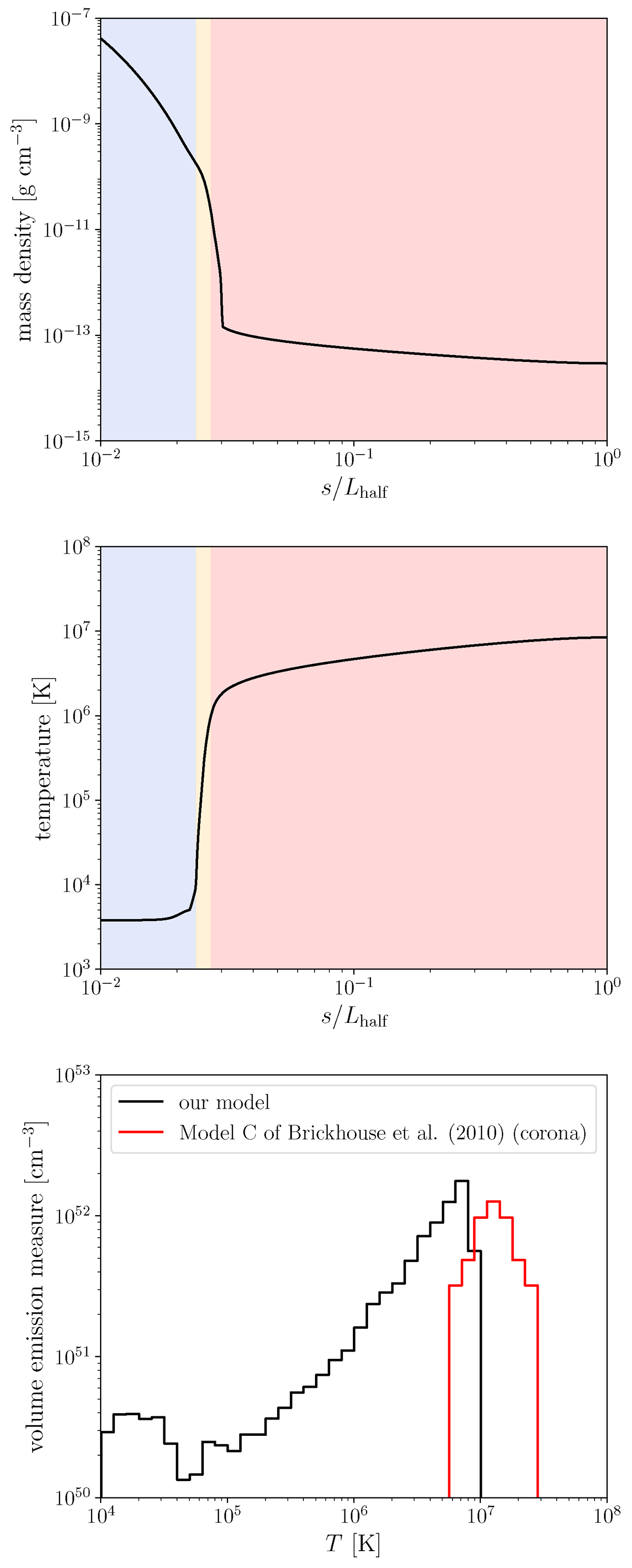
Time-averaged simulation results. The top panel illustrates the density along the loop, and the middle panel shows the temperature distribution along the loop. The shaded blue, orange, and red areas represent the chromosphere (T < 104 K), transition region (T = 104 − 6 K), and corona (T > 106 K), respectively. The bottom panel presents the volume emission measure distribution, and the red line represents the coronal emission measure inferred from X-ray observations (Model C in Brickhouse et al. 2010).
Current usage metrics show cumulative count of Article Views (full-text article views including HTML views, PDF and ePub downloads, according to the available data) and Abstracts Views on Vision4Press platform.
Data correspond to usage on the plateform after 2015. The current usage metrics is available 48-96 hours after online publication and is updated daily on week days.
Initial download of the metrics may take a while.