Fig. 5.
Download original image
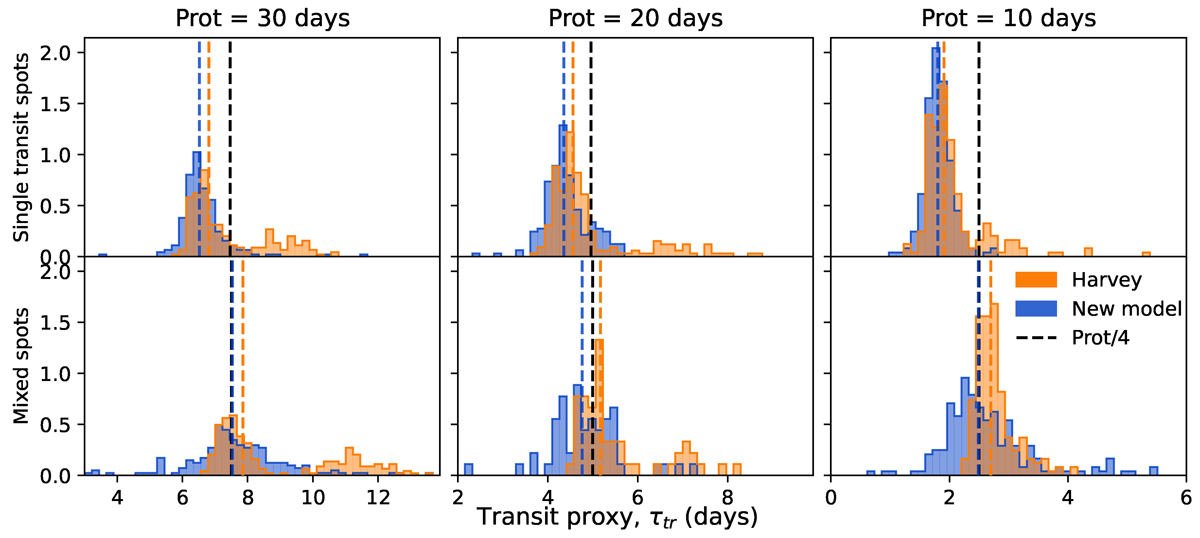
Same as Figure 4 but for the transit proxy τtr. The histograms in blue correspond to the value found by our model, and the ones in orange to the value found by the model of Harvey. The vertical black dashed lines indicate the expected value for each set of simulations, which corresponds to Prot/4. The coloured dashed lines represent the median value of each distribution.
Current usage metrics show cumulative count of Article Views (full-text article views including HTML views, PDF and ePub downloads, according to the available data) and Abstracts Views on Vision4Press platform.
Data correspond to usage on the plateform after 2015. The current usage metrics is available 48-96 hours after online publication and is updated daily on week days.
Initial download of the metrics may take a while.